

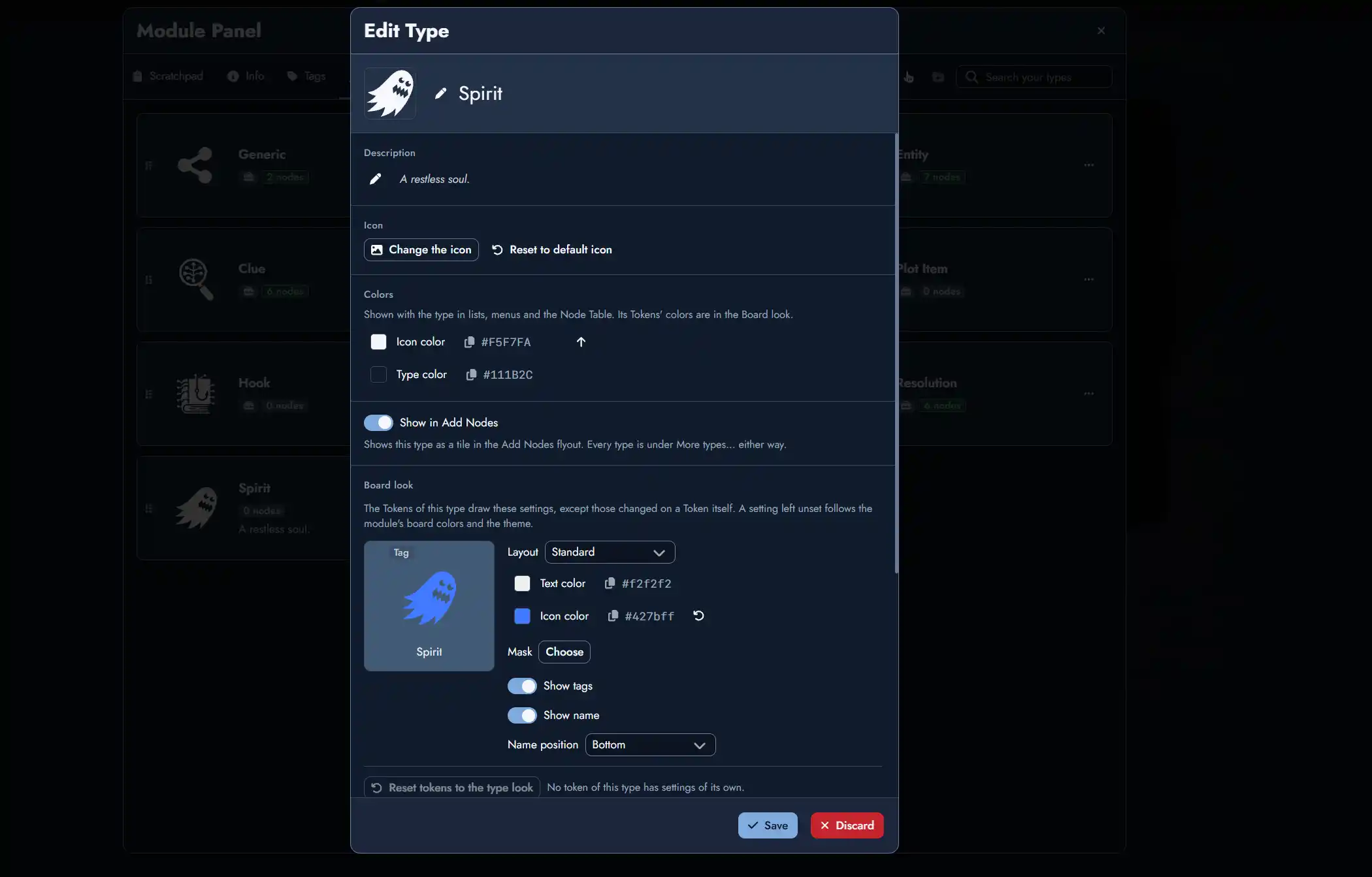
Hey, everyone! This update brings Custom Node Types.
Everyone can now restyle the nine built-in Node Types, giving each its own icon, colors and Board look, and import ready-made types from Type Collections and templates. With a premium account, you can also create your own Node Types and give each one its own defaults. You can also build Type Collections to reuse them across your Modules.
We’ve also added tables to the Editor and folders in the section “Your Images” of the Library, along with a few quality of life improvements and some bugfixes.
Hope you enjoy!
Release Highlights
Custom Node Types
Every Module now has its own set of Node Types. The nine built-in types are still there, and you can now add your own, so a Faction, a Deity or a Spell can sit next to your Characters and Locations. Open the Module Panel and choose the new Types tab to manage them.
- Give each type a name, description, icon and colours, and choose whether it appears among the Add Nodes tiles. The built-in types can be customized too.
- Choose a type’s layout, colours, border and page style once, and all its tokens follow. A token you restyle keeps its own settings, and Set as default for a type turns that token’s look into the type’s look.
- Set default Tags, content and a Random Table, and every new Node of that type starts with them.
- Drag the type cards to reorder them, and every type list follows that order. Types you’ve hidden from “Add Nodes” stay one click away under “More types…“.
Creating, duplicating, renaming and describing types, deleting built-in types, and setting Defaults are available with a premium account. Everyone can use, restyle and reorder every type a Module holds, and delete the ones they’ve added.
Type Collections
Type Collections let you build a set of Node Types once and reuse it in any of your Modules. You’ll find them in the new Type Collections tab of the Library.
- Create a Collection in the Library, or add types to it straight from a Module’s Types tab.
- Import a collection into a Module and choose what to apply. When you change the collection later, the Modules that use it get a notification in the bell, so you can review the changes.
- Templates now bring the Node Types they use. If a type is set up differently in your Module, you choose which version to keep, or keep both.
Importing and updating Type Collections is available to everyone. Creating and editing them is available with a premium account.
Tables in the Editor
Type / and choose Table to insert a table with a header row, in a Page or in a Node’s content.
- Tab and Shift + Tab move between cells, and Tab in the last cell adds a row. Enter starts a new line inside a cell.
- Use the + bars to add a column or a row, or drag the corner + to add several at once. Drag a row or column by its grip to move it.
- Click a grip to insert, move, duplicate, clear or delete a row or column, align a column to the left, center or right, or delete the table.
- Markdown and Obsidian Markdown exports turn tables into standard Markdown tables that keep column alignment, and HTML exports keep the table as it is. Print Preview and reader mode show tables without their controls, and a table is never split across two printed pages.
Folders in Your Images
You can now sort Your Images into folders, wherever you browse them: in the Lobby’s Library, in a Module’s Library and in the image pickers.
- Create folders, drag and drop images into them or use Move to Folder. Select several images at once with Ctrl + click (Cmd + click on Mac) or Shift + click.
- Switch between Icon view and List view, which shows each image’s name, type and date added.
- Search looks in every folder and shows where each result is. New uploads and links go straight into the open folder.
Other Improvements
- You can now modify the font of your Link labels: Link Token Settings > Label > Font lets you choose a font for a Link’s label. Reset font brings back the default. Copying and pasting Link Token settings, and Set as Default, will now both include the font.
- Your profile and plan now have their own page, Account, in the Lobby menu and in the bottom bar on phones, and Settings now holds only app preferences.
- A clearer Tag import: When a template brings Tags that match yours, its Import window now shows one card per Tag, with what differs. Choose Keep yours or Keep both (and name the new Tag), or use Set all to: for every Tag at once. The window also lists everything else the template adds to your Module.
- The Module Panel is wider on large screens, and its Types and Tags tabs show up to three columns of cards.
- Image links in Your Images now show the date you added them (in list view).
Bug Fixes
- Readers of a shared Module no longer see a formatting toolbar on the Module’s description in the Module Panel.
- Escape now closes the Tag and View editors after you close their colour picker with its double-chevron button.
- In the Editor, the highlighted item of the slash command menu is now easy to read with the Standard page style, whatever the Module’s theme, and with the Quantum page style.
Leave a Reply