

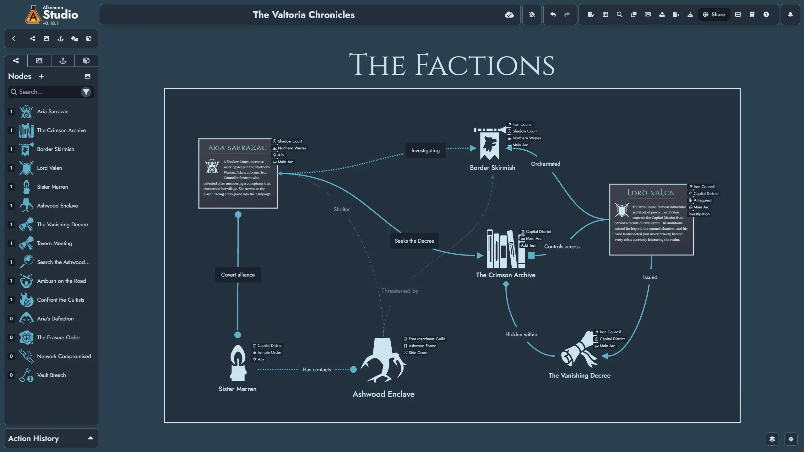
Hey, everyone! This update brings a refreshed interface, 20 interface themes, and a new Print Preview. We’ve also added more ways to arrange and customize your Board, and a few quality of life features that have emerged on the Discord server these past few weeks. Hope you enjoy!
Release Highlights
A Refreshed Interface
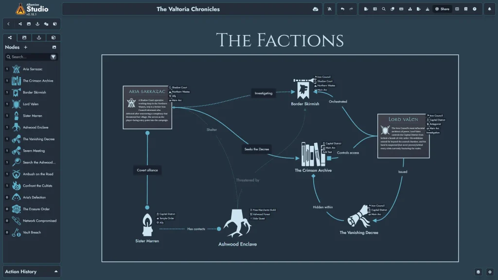
After three years of intense development and so many features added, some parts of the interface started to look and behave differently when they should have been consistent. As we had to focus a lot on the user interface to implement the new theme support these past three months, we’ve taken the opportunity to do dozens of small changes to layouts, controls and colors to bring them back into line.
- More room for your work: More compact controls leave extra space for your Board and content.
- More consistent controls: Buttons, menus, forms, and dialogs now look and behave more uniformly.
- Clearer feedback: Improved focus and interaction states help you see what’s selected and which controls are active.
The layout should still feel familiar without making you learn how to use the app again.
Interface Themes
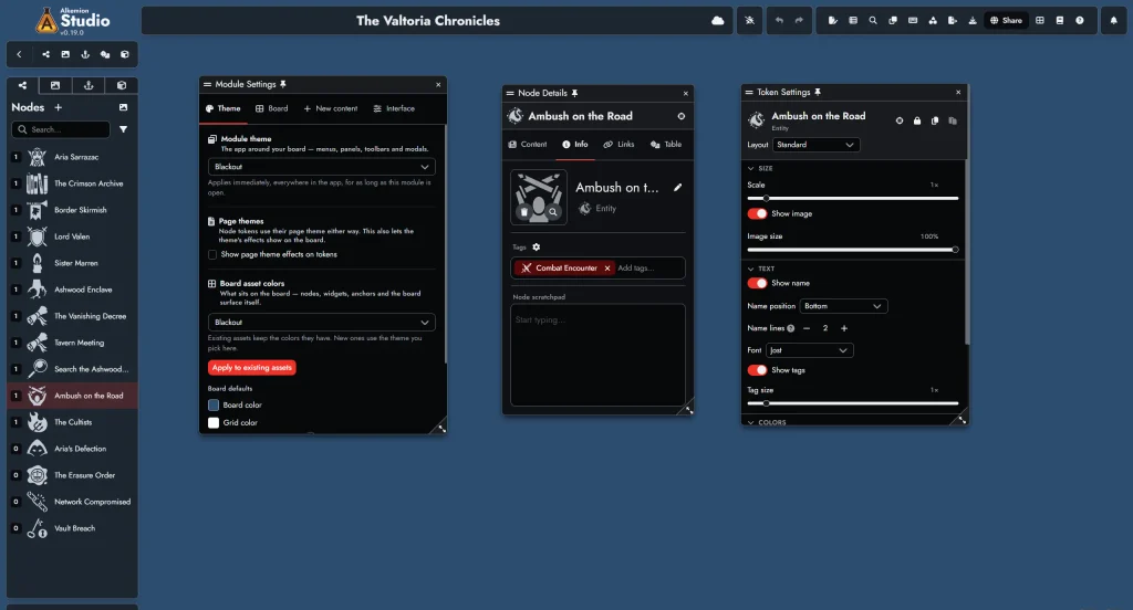
You can now choose from up to 20 interface themes, with 10 available to everyone and 10 additional themes for Champion Patreon supporters. We’ve adapted our existing Editor page styles into themes for the rest of the application and you should find a nice range of palettes.
As always, we wanted to give you options. So we designed different layers where you can apply the themes:
- Set your app theme in Lobby Settings to choose the look you use across Alkemion Studio.
- Give a Module its own theme in Module Settings. While that Module is open, its theme applies to the surrounding interface, including menus, panels, toolbars, and dialogs. You can also leave it set to follow your app theme.
- Choose Board asset colors separately. New assets use your selected palette. Existing assets keep their colors unless you choose Apply to existing assets, which preserves colors you’ve customized yourself.
Each interface theme is designed to work with one or two of the Editor’s page styles, but any combination that suits you is the right one!
A New Print Preview
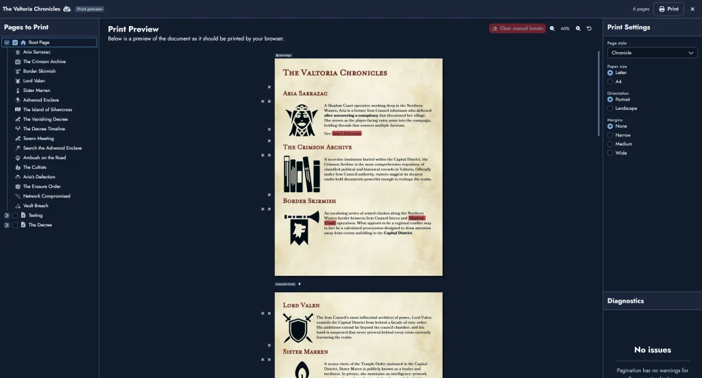
The new Print Preview lets you prepare your Module’s pages before printing or saving them as a PDF. It automatically arranges content across printed pages and updates as you make changes.
- Choose what to include: Select individual Pages or whole folders from the content tree, then jump directly to a Page in the preview.
- Set up your paper: Choose a page style, A4 or Letter paper, portrait or landscape orientation, and a margin size.
- Adjust page breaks: Add or remove breaks directly in the preview, without placing your cursor in the Editor. Automatic breaks remain clearly marked.
The Export window now includes a direct link to Print Preview.
New Features
Board Layout and Token Customization
- Align and distribute tokens: Select several tokens, right-click, and use Align to line them up by their left, right, top, or bottom edges, or by their centers. Distribute spaces three or more tokens evenly, horizontally or vertically. Each command supports Undo and has a keyboard shortcut.
- Smaller tokens and tags: Node Tokens and their tag overlays can now scale down to 0.75x, 0.5x, or 0.25x. Both sliders are available in Token Settings. Existing tokens and tags keep their current size.
- Image size and name position: Image Size lets you shrink the featured image or icon on Standard and Image layouts. Name position places the name above, below, to the left, or to the right of the image on Standard and Image Card layouts, or above or below the content on Content Cards. These settings support Undo and are included when copying and pasting token settings.
- Custom name fonts: Standard and Image Card Node Tokens now let you choose a font for the Node name, just as you can for Text Blocks.
- More compact cards: Content Card Node Tokens can now shrink to 150 × 150, down from the previous 300 × 400 minimum. Image Cards share the new minimum size, making compact landscape cards possible too.
Node and Page Navigation
- Choose which Page a Node opens: Double-clicking a Node Token no longer has to open the Root Page. Set the Node’s default Page using the Opens on picker in its Content tab or the Editor’s Info panel. You can override that choice for an individual token in Token Settings.
- Add Nodes to several Pages at once: Choose Add to Pages… from a Node’s Board context menu, a selection of Node Tokens, or a Node’s context menu in the Editor’s content tree. Select the destination Pages, or type a Page’s name and press Enter. You can also choose destination Pages when creating a Node in the Add Node window.
- Anchors to Views in the current Module: Module Anchors can now target Current Module and one of its Views, panning the Board directly to that View. This option becomes available once the Module has at least one View. These Anchors work for readers and are preserved when duplicating the Module.
- Open details for locked Nodes: Ctrl+click a locked Node Token (Cmd+click on Mac), or select it and press I, to open its Info panel without unlocking it. Locked tokens still show no hover popups, so you can check their details without enabling accidental movement.
Random Tables
- See each entry’s odds: Hover over a roll range to see the chance of rolling that entry, or click the % button in the column header to show odds on every row. Tables with weights enabled show odds automatically.
- Descriptions across multiple lines: Random Table entry descriptions now support line breaks, including for small nested tables. Press Shift+Enter to add a line, or Enter on phones and tablets.
- Choose which Nodes get re-rolled: Two options in Module Settings let you skip Nodes with no tokens on the Board and Nodes whose tokens are all locked. To preserve a Node’s roll with the second option enabled, lock all its tokens.
- Optional italics for descriptions: Enable Don’t italicize random item descriptions in Module Settings to display descriptions in regular text. Italics remain the default, and the preference is saved per Module.
Improvements
Settings and Board Controls
- Board Settings is now Module Settings, organized into four tabs: Theme, Board, New content, and Interface. A single Double-click on empty board option lets you choose which Node type to create or turn creation off. The panel reopens on the tab you last used.
- Token Settings has been redesigned with collapsible sections, clearer labels, and reset buttons. Each token shows only the settings relevant to it. Copying and pasting now includes every visual setting, and several fixes make settings changes reliably undoable.
- A new Hide tags on new node tokens option in Module Settings creates new Node Tokens with their tags hidden. You can still show tags on any individual token in Token Settings.
- Selected tokens’ toolbars temporarily hide while you pan or zoom the Board, then reappear when you stop.
- Creating a Board View now flashes a thin white frame around the screen edges in place of the full-screen white flash.
- Text Widgets now support a maximum font size of 2500, up from 1000, so they can match the largest group titles. The new limit applies to the Font Size slider, toolbar input, and resize handle.
- You can now rename a node straight from the board’s content tree: right-click it and choose Rename Node, type the new name, and press Enter. You can undo the rename like any other change.
Editor, Timelines, and Library
- Slash commands within paragraphs: Type / after a space or at the start of a line to open the slash command menu, change the block style, or insert a mention or image. Slashes within or immediately after a word remain ordinary text, so and/or and 1/2 won’t open the menu.
- The Root Page is now marked as a system page, with an explanation of why it can’t be moved, renamed, or deleted.
- Choosing Rename in the Editor’s content tree now selects the whole name, ready to replace. Nodes, Maps, and Timelines can also be renamed from their right-click menus.
- In Map and Timeline content blocks, the first press of Escape leaves title editing, text editing, or interaction with the Map or Timeline. A second press closes the Page Editor, matching Node Content Block behavior.
- With snapping disabled, Timeline Markers can now be placed between whole units. References snap to nearby Markers regardless of the snapping setting, and a Marker’s line highlights when a Reference snaps to it.
- Double-clicking an image, icon, or mask in the Lobby’s Library now opens a zoomed view. Zoomed masks display as white silhouettes, matching their thumbnails.
- In the Editor, Token Card Content is now visible only to the Module owner and no longer appears to readers of shared Modules.
Bug Fixes
- Node icons in the @ mention menu now use the page style’s text color, fixing cases where they appeared in the wrong color, often white.
- Copying a Map or Timeline content block from the Root Page to another Page now preserves its attached text and display settings.
- The Cyberpunk page style’s accent line now appears under Map and Timeline titles, including in Print Preview, and hides when a Node, Map, or Timeline title is hidden.
- Fixed a dark fill behind non-square featured images on Timeline References embedded in Pages. The surrounding area is now transparent, matching the Board.
- Anchor toolbar tooltips now refer to Anchors rather than Widgets.
- Fixed the Board grid in Chrome and Brave so smaller grid squares remain visible and evenly spaced at every zoom level.
Leave a Reply